
An effective and sustainable reorganization of the sales process. The aim is to link online and offline, seamlessly integrating planners and developers, professionals, and end customers on a common platform.
HOLTER is an owner-managed plumbing and heating wholesale business with headquarters in Wels and 25 locations in Austria and Germany.
- Industries
- Retail
- Wholesale
- Solutions
- Websites
- UX & UI Design
- Award
- Nominee UX Design Awards 2017
The initial situation
Until recently, HOLTER has maintained a landscape of individual websites to cover different target groups and topics, trying to gain influence on complex purchase decision processes with many participants: property developers define budgets, planners provide framework conditions, end customers decide according to taste, and plumbers close the purchases. In a decision-making matrix like this, systematic lead generation will necessarily hit more than wall.
The solution
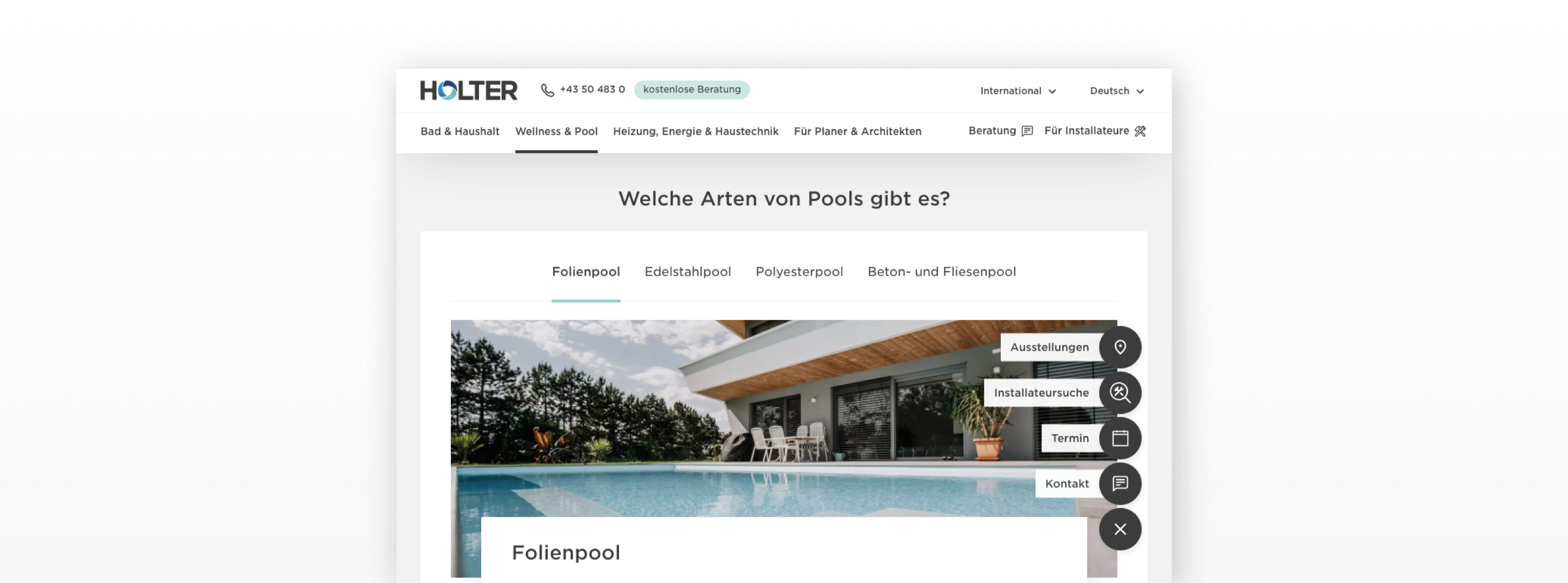
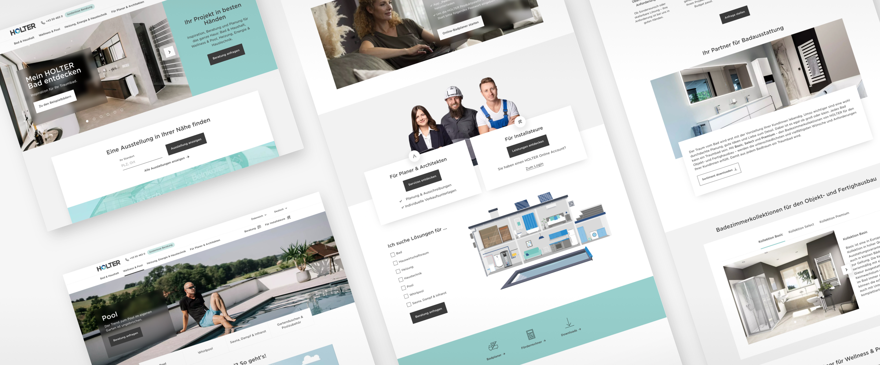
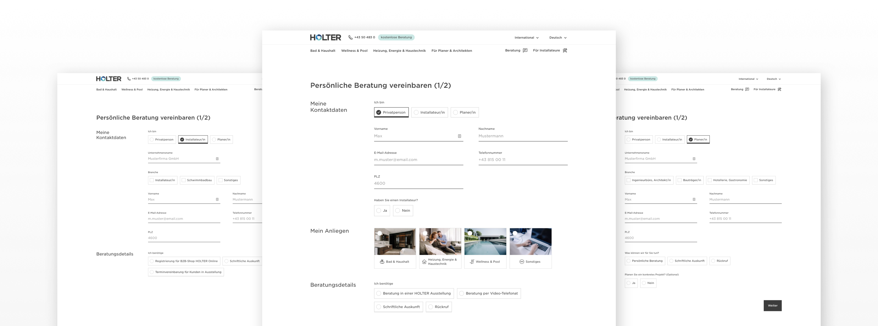
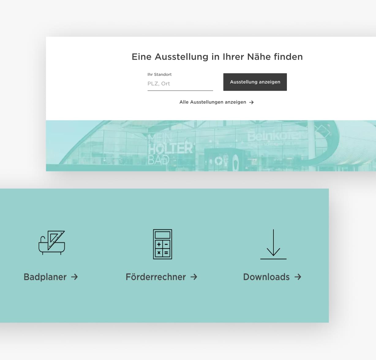
Merging the former website landscape into a unified platform for all target groups. New landing pages and intelligent contact forms provide target group-specific product access for plumbers, planners, architects, property developers - and end customers as well.
The design approach
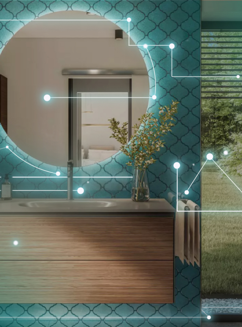
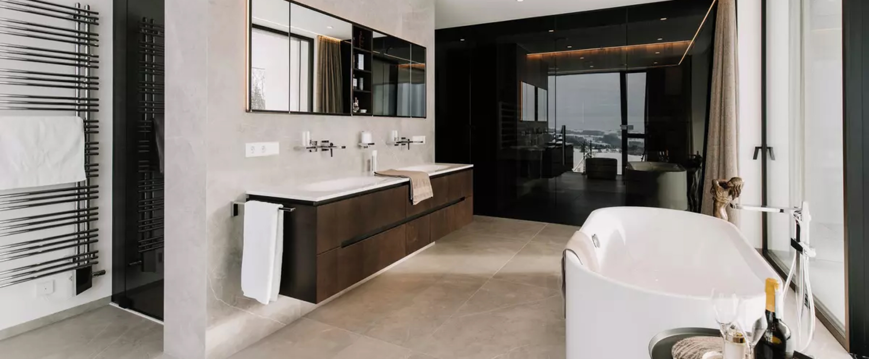
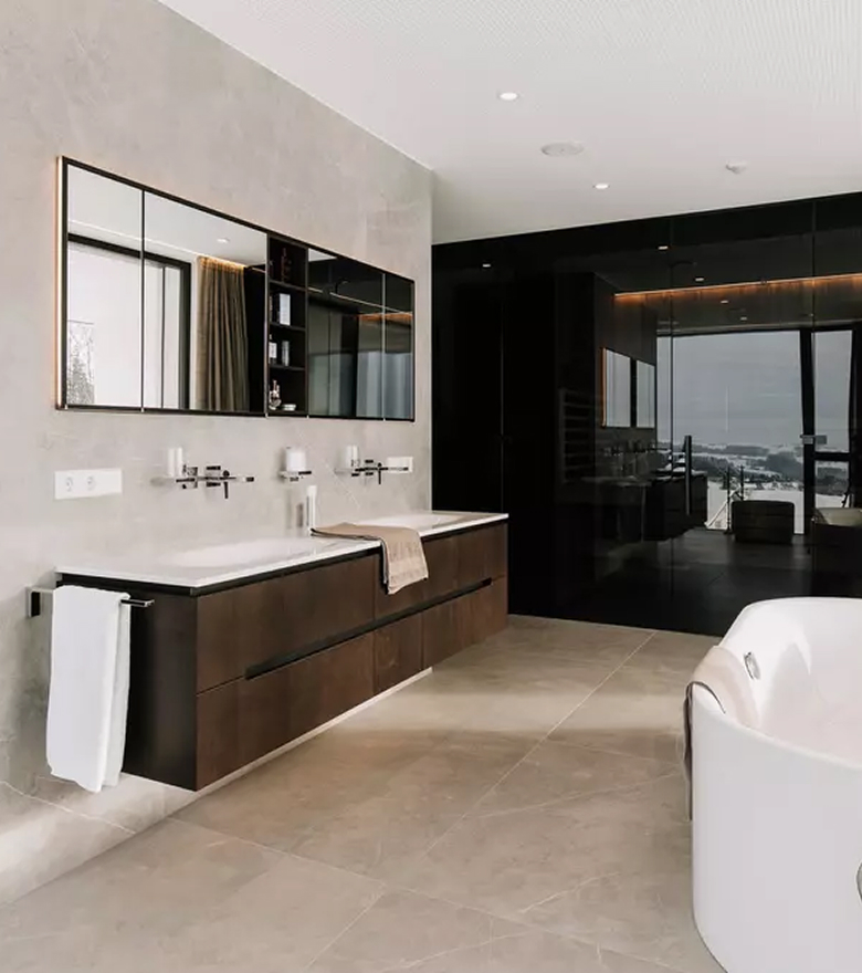
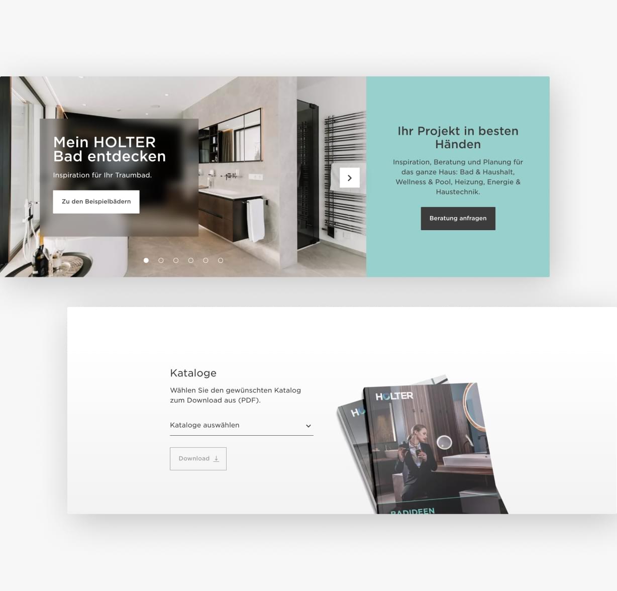
Boiling down the organically grown design diversity of the HOLTER websites to create a uniform look & feel with a strict focus on best user experience. An initial key page design defines all layout components. The core idea is a transparent glass box design specially developed for HOLTER, which allows images to shine through under text. Elegant reduction to essentials dominates the layout: Generous use of space is a subliminal quality signal. A well thought-out color concept and specially developed icons support intuitive navigation.


The strict user orientation
The development was guided by workshops with the most important target groups. Those provided parameters for best usability and customer centricity. The final result is a website structure through which the user leafs like through a customized personal catalog. The entire product portfolio, including current product line expansions like pools and building services, is available and for single-item viewing and in helpful “shop the look” combinations. All core target groups will be guided on paths that meet their individual information needs. The user journey leads to smart contact forms that facilitate inquiries in target group-specific layouts, including upload options for images and plans. Advice by video call is also available. “Floating action buttons” encourage spontaneous contacts.
The result
A pleasantly unified web world, created in a collaboration process that has proved extremely satisfactory for everyone involved.